We’ve all heard the expression the cobbler’s children go barefoot. Well I’ve been running around barefoot for the past several years.
When I first started my full time copywriting business three years ago, one day I looked at the calendar and realized I had a networking meeting coming up and I didn’t have any business cards.
I phoned around to 
However, now that The Baby Boomer Entrepreneur has taken off and I’m doing workshops, teleseminars, public speaking and ebooks in addition to the blog (which doesn’t appear on my old business card) I decided it’s time for a more professional look.
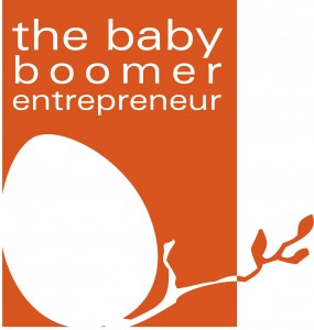
I called my friend and colleague Jennifer Harris at www.Keylimecreative.ca. I’ve worked with on projects for clients and know she does good work. I set her off to design a logo for The Baby Boomer Entrepreneur. I didn’t give her much direction, but boy did she come up with something great.
This logo is clean and looks good large or small. I love the egg and the branch which have an organic feel and represent new possibilities and growth. I can use the logo in many different colours. And Jen gave me a version without the text so I can use it in a variety of different applications. I think she really nailed it!
I’ve created a look with the theme of this blog, but now I can start branding myself visually on everything I produce. I can’t wait to start using this logo. Thanks Jen!
Andrea J. Stenberg
Let me know what you think of my new logo or share your experiences getting a logo designed or branding your business. What challenges did you face? What went well?


